Aero
A one-stop online shop for bikers.
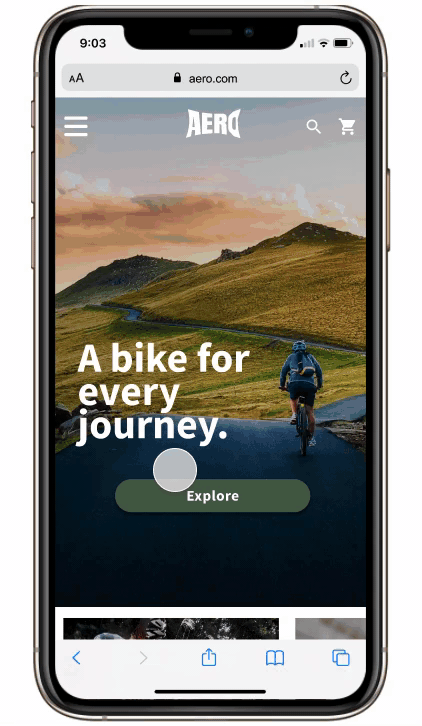
Aero is the industry leader when it comes to bikes, offering avid bikers a one-stop shop to discover, learn and purchase the best bike that meets their needs.
Tools used: Figma
User Interviews
While that data was very helpful, I felt like there were some missing elements. I decided in order to best understand the problem, I needed to speak with bikers to hear about their personal experiences with shopping for bikes online.
Through community outreach, I was able to identify five avid bikers to interview. I asked them a series of questions on their shopping behaviors as well as personal experiences when it came to purchasing a bike both in person and online. Not being a biker myself, I found this step to be incredibly helpful in understanding the goals, frustrations and overall passion bikers have.
USER RESEARCH
Secondary research
For this project, I adopted both a generative and evaluative approach. I received initial data from my Product Manager to consider before approaching the problem.
70% of users who place an item in their cart do not purchase. Data shows that users abandon the cart at the registration page. Right now, users are required make an account to purchase.
50% of users open on average 7 item pages and then abandon the site without moving any items into the cart. My PM’s hypothesis is that users are unable to determine which bike is best based on relative features.
How Might We Questions
Looking at my user’s journey map, I was able to identify what I wanted to improve upon and developed my How Might We Questions. These statements allowed me to remain focused on the user throughout every stage of the project.
How might we instill a sense of trust when users are using the Aero website?
How might we inform and educate the user so that they feel confident in completing a purchase?
How might we create a more fluid check-out experience?
DEVELOPING USER PERSONA AND JOURNEY
After my user interviews and affinity mapping, the main pattern I discovered was that users want to feel like they can TRUST the Aero website. I created a journey map to show the current flow and frustrations users experience, and was then able to identify key areas I wanted to improve upon.

DESIGNING THE SOLUTION
Originally, I thought that incorporating a quiz for the user to take in order to find the best bike options was the solution to making them feel more confident in their purchase. However, after more consideration and listening to my user interviews again, I realized that the majority of ‘avid bikers’ already have an idea of what type of bike they are looking for. To feel more confident in buying a bike online, they need more details on the bike's specs, features, and help deciding between what is available to them.

High Fidelity Prototype
My goal was to create an informative mobile-website that users could trust to answer all of their biking questions and feel confident in their purchase. To instill that sense of trust, I added a comparison feature to help them decide between two bikes, and guest check-out

I conducted five virtually moderated usability tests on avid bikers. My goal was to identify the strengths and weaknesses of both the user flow and the design of the app, as well as answer the below questions.
Does the Aero mobile-website provide the user with enough information and features to create a sense of trust, where the users feel comfortable in making a purchase.
What are the most common errors/points of confusion on the Aero mobile-website?
How do participants respond to the design of the mobile-website?
Through my first round of user testing and talking with my mentor, I was able to identify some key areas of improvement:
TESTING THE SOLUTION
ITERATE
I focused on creating a more minimalistic design to avoid overwhelming the user and easing their shopping experience. In addition to this, I added in various design elements and brand features, in order to position Aero as a trustworthy brand.

Deciding whether to make the add to cart fixed or not was a major challenge that I faced. Secondary research highlighted the benefits of a fixed check-out button; however, people’s comments (including one of my users) argued that it was too pushy. In the end, I decided that the Aero brand is dependable and informative, not pushy - so I removed the fixed position. All buttons that lead to making a purchase are the same size and color to create consistency.

In my second iteration, users can see what has already been selected to compare. The compare button remains disabled until two bikes have been selected to compare.

PROJECT TAKEAWAYS
Coming from a marketing background, user shopping behaviors have always interested me. The major lessons I learned during this process were:
Listen to the users. The information my PM provided was very helpful, but I am also glad that I spoke to users before jumping to conclusions. I was able to identify other key areas of improvement through user interviews.
Every function has a purpose. While I originally thought a quiz in the beginning of the user flow would help users find a fitting bike, I realized that that function would be irrelevant for my target users (avid bikers) who would visit the site with an idea of what they already wanted.
Keep a minimalist design. After conducting user testing on my prototype, most of the confusion my users experience was due to a cluttered design or lack of key indicators. By eliminating unnecessary information, I was able to create more white space and an overall cleaner design.